 MailDirect Help
Understanding MailDirect User Interface
Understanding MailDirect User Interface
MailDirect is a browser independent service. The user interface consists of a menu and the area below the menu, organized according to the options selected from the menu.
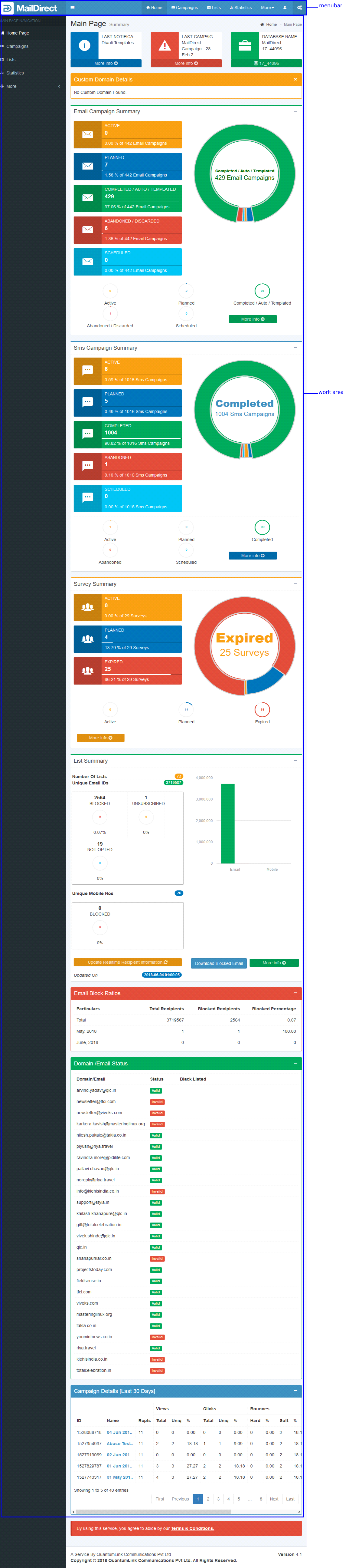
Figure : MailDirect User Interface
Title Bar
The Title Bar displays the title of the window and additional information. In MailDirect, the Title Bar is divided into two parts.

Figure : Title Bar
The first part displays the name of the service being used. The second part displays the name of the browser running MailDirect.
Menu Bar
The Menu Bar lists all the menu options available for selection in MailDirect.
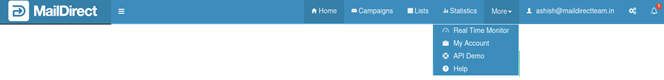
Figure : Menu Bar
Navigation Menus
The navigation links available in the Home Page are:
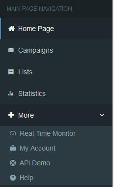
Figure : Home Page Menu Options
The navigation links available in the Campaign Menu are:
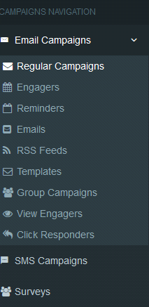
Figure : Campaign Menu Options
The navigation links available in the List Menu are:
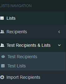
Figure : List Menu Options
The commands available in the Stats Menu are:
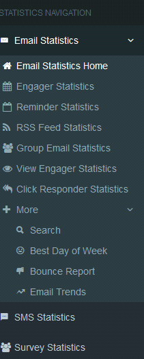
Figure : Stats Menu Option
The commands available in the Accounts Link are:
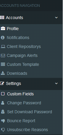
Figure : Account Menu Option
Theme/Skins Menu
In Menu Bar the theme option is available to change theme/skin color of this panel at Home Page.
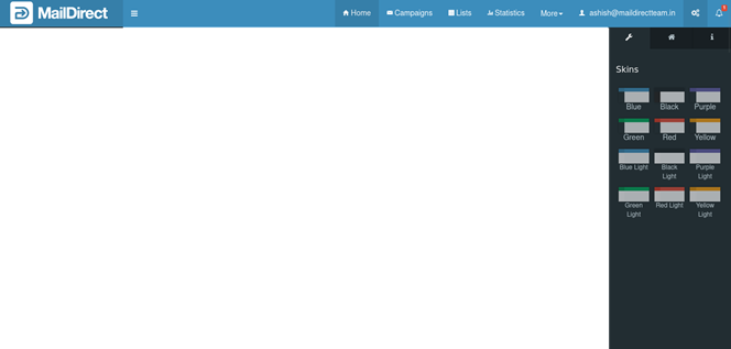
Figure : Home Page Theme Change Option
Blue Theme/Skin
In Blue theme/skin is the default theme/skin.
The theme is selected by selecting Blue Theme/Skin from Themes/Skins and will look as shown below.
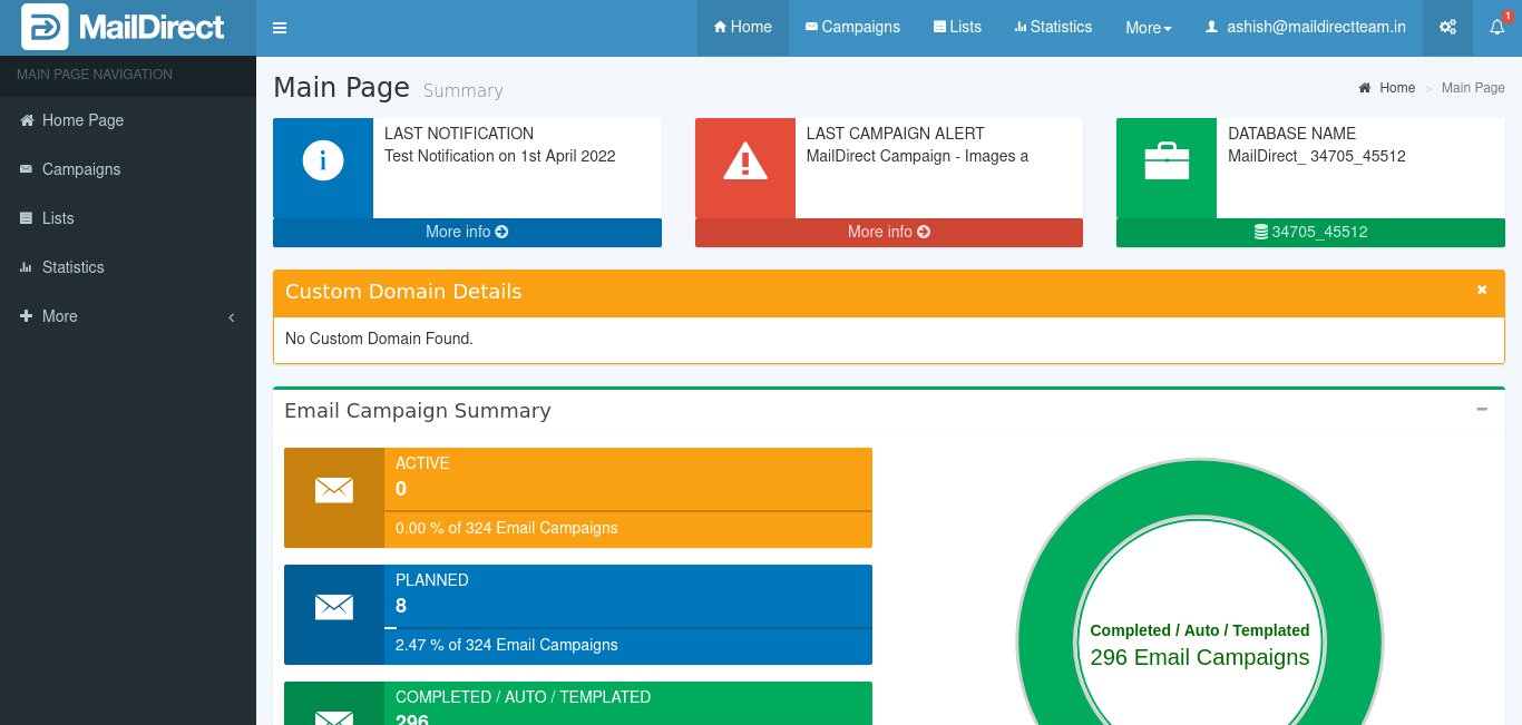
Figure : Blue Theme/Skin
Black Theme/Skin
The theme/skin is selected by selecting Black Theme/Skin and will look as shown below.
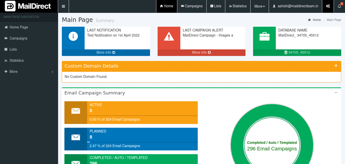
Figure : Black Theme/Skin
Purple Theme/Skin
The theme/skin is selected by selecting Purple Theme/Skin and will look as shown below.
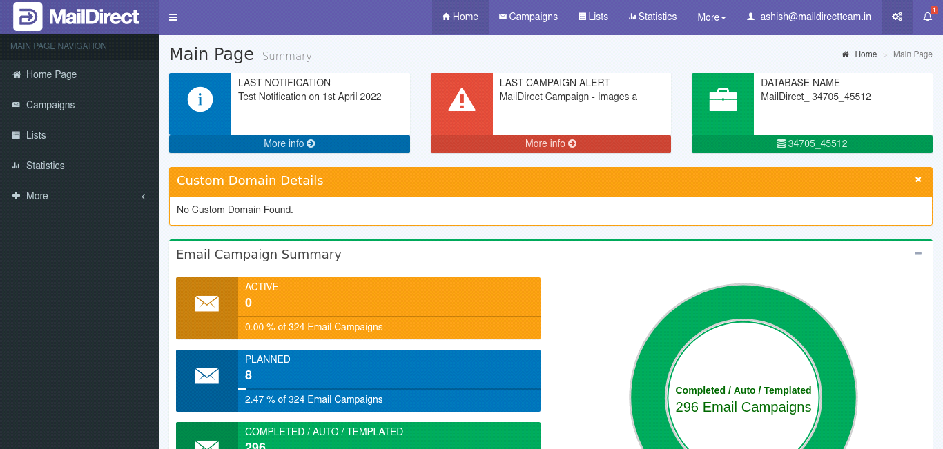
Figure : Purple Theme/Skin
Green Theme/Skin
The theme/skin is selected by selecting Green Theme/Skin and will look as shown below.
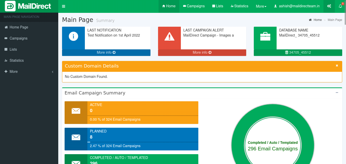
Figure : Green Theme/Skin
Red Theme/Skin
The theme/skin is selected by selecting Red Theme/Skin and will look as shown below.
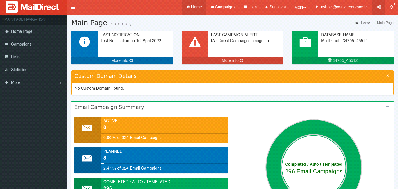
Figure : Red Theme/Skin
Yellow Theme/Skin
The theme/skin is selected by selecting Yellow Theme/Skin and will look as shown below.
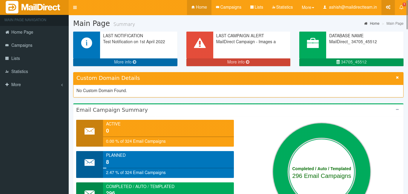
Figure : Yellow Theme/Skin
Blue Light Theme/Skin
The theme/skin is selected by selecting Blue Light Theme/Skin and will look as shown below.
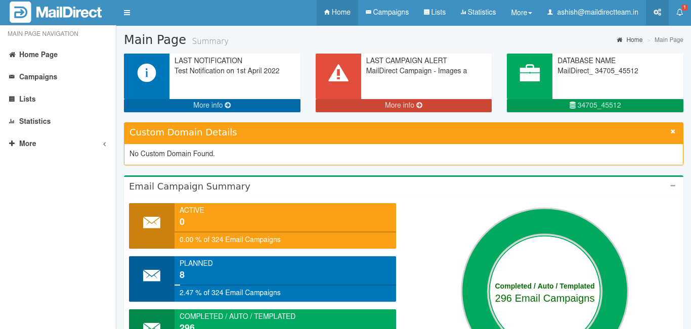
Figure : Blue Light Theme/Skin
Black Light Theme/Skin
The theme/skin is selected by selecting Black Light Theme/Skin and will look as shown below.
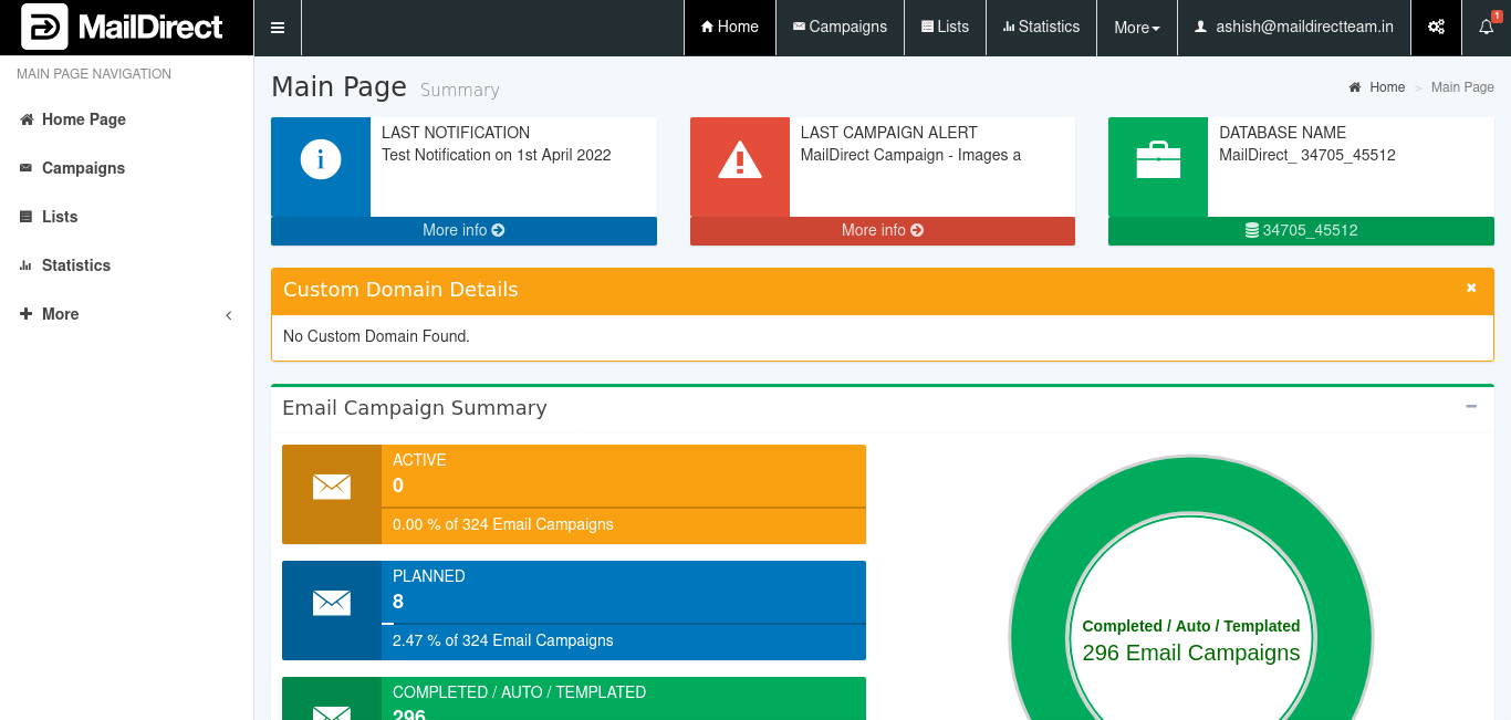
Figure : Black Light Theme/Skin
Purple Light Theme/Skin
The theme/skin is selected by selecting Purple Light Theme/Skin and will look as shown below.
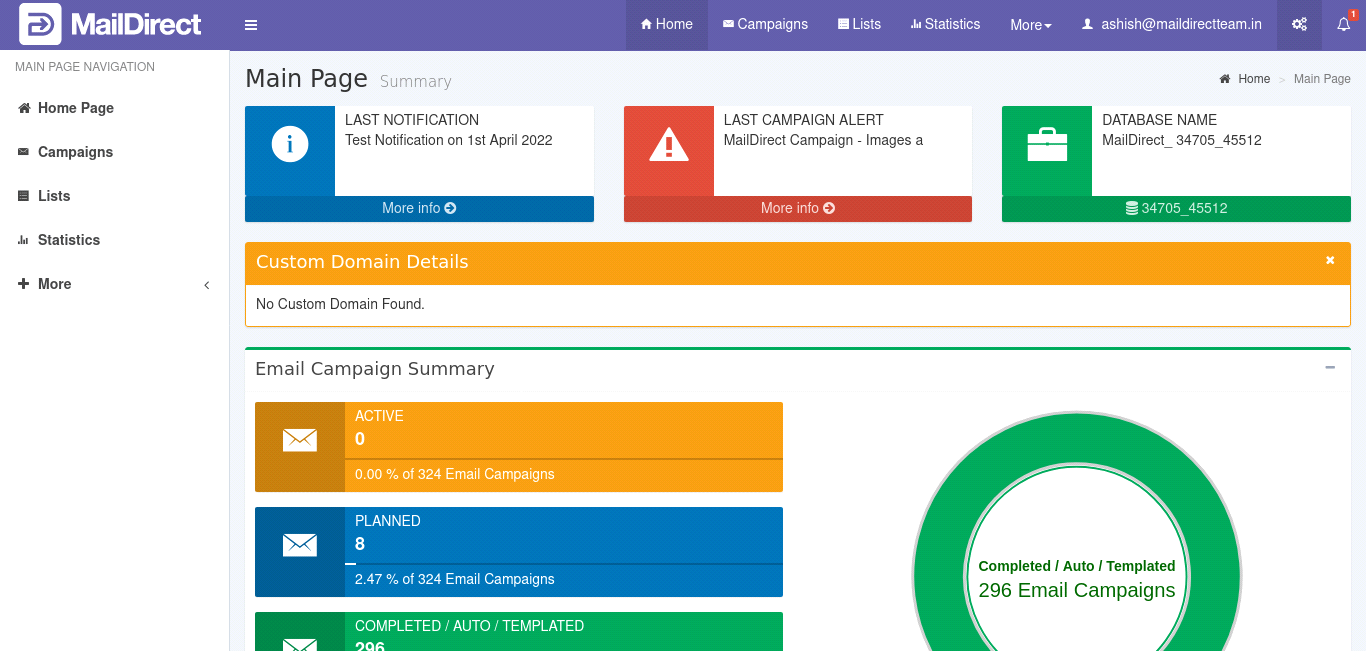
Figure : Purple Light Theme/Skin
Green Light Theme/Skin
The theme/skin is selected by selecting Green Light Theme/Skin and will look as shown below.

Figure : Green Light Theme/Skin
Red Light Theme/Skin
The theme/skin is selected by selecting Red Light Theme/Skin and will look as shown below.
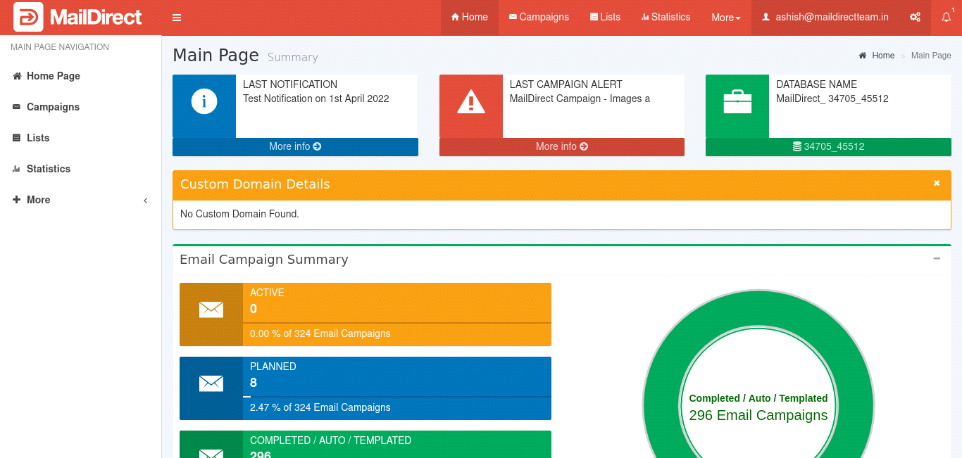
Figure : Red Light Theme/Skin
Yellow Light Theme/Skin
The theme/skin is selected by selecting Yellow Light Theme/Skin and will look as shown below.
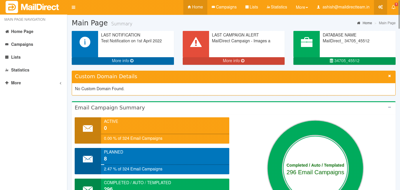
Figure : Yellow Light Theme/Skin
This guide will display the images based on the default Theme/Skin i.e. Blue.
Services Details
On Clicking Home Icon the Services Details are displayed:
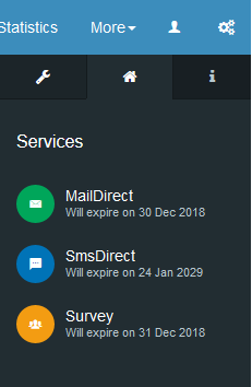
Figure : Services Details
User Info
On Clicking Info Icon the User Details are displayed:
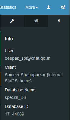
Figure : User Info